A custom function to produce a histogram with a normal curve overlay showing critical 5 percent regions.
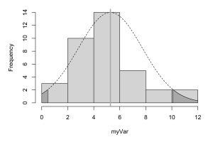

A custom function to produce a histogram with a normal curve overlay showing critical 5 percent regions.
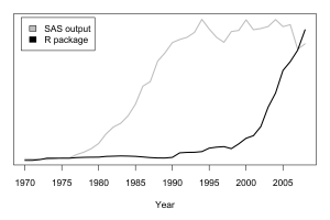
A simple line plot showing Google ngram data on the frequency of the terms “SAS output” and “R Package”
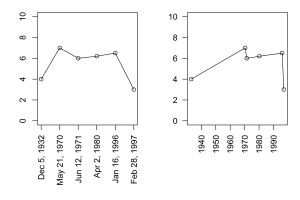
Two side by side line plots showing different date handling
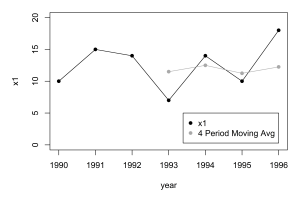
A line plot with a 4 period moving average (Black and White)
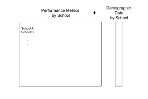
The column concatenation illustration using shape drawing.
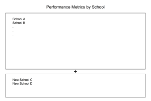
The row concatenation illustration from ch. 10, showing rectangle drawing and text placement
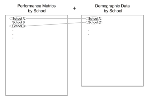
An illustration of match merging, which uses shape drawing and a custom function for drawing ovals
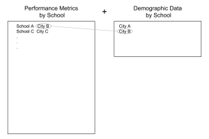
Keyed-table look up illustration using the custom oval function

A horizontal dot chart showing the number of missing observations
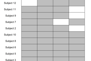
A grid for visualizing missing values using polygon drawing and shading
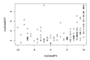
A default scatterplot of corruption against polity (democracy) level
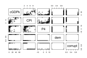
A default pairs plot of corruption and polity data